Lookbooks
E-Vites
Merchandising
ASDA’s George brand approached us to look at the new Lookbook design for both their women’s and kids fashion ranges for 2017 based on our reputation for creativity built up through working with George Home.
The main brief was that the Lookbook design needed to create impact and build reputation with the press. The Women’s Lookbook was to be full size and the kids Lookbook needed to be a smaller version that would follow a similar design theme.
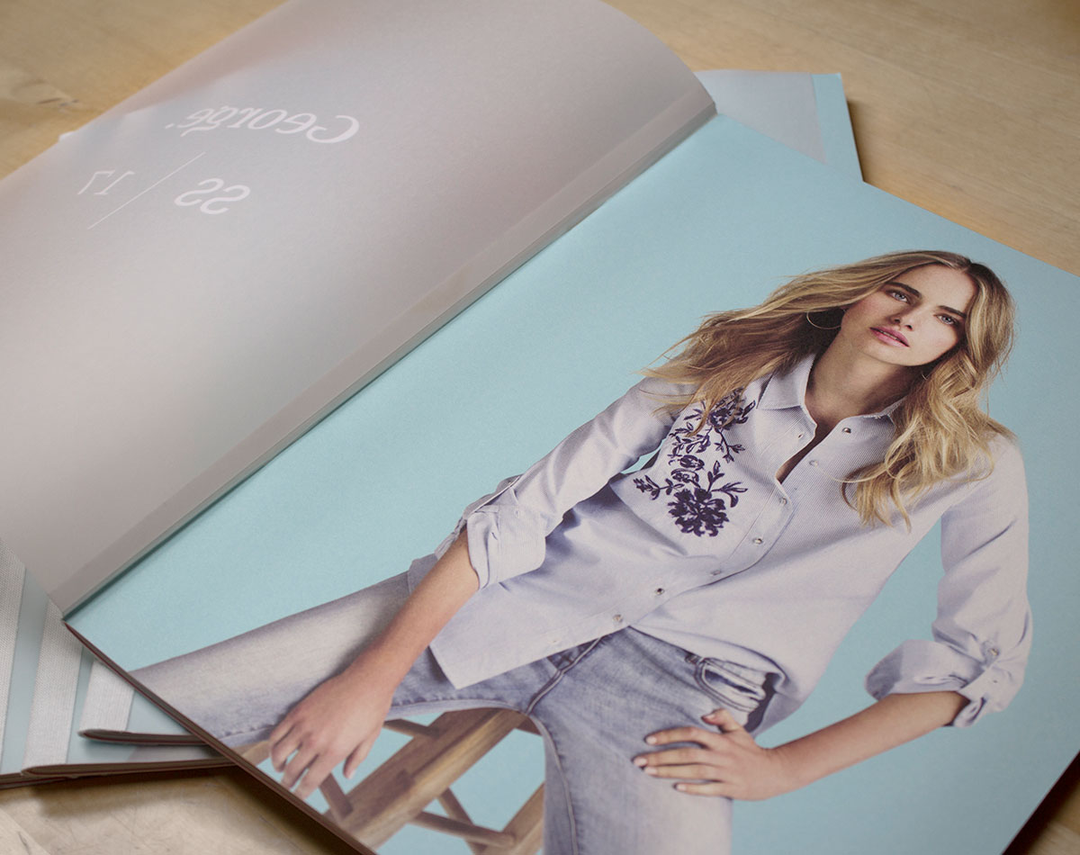
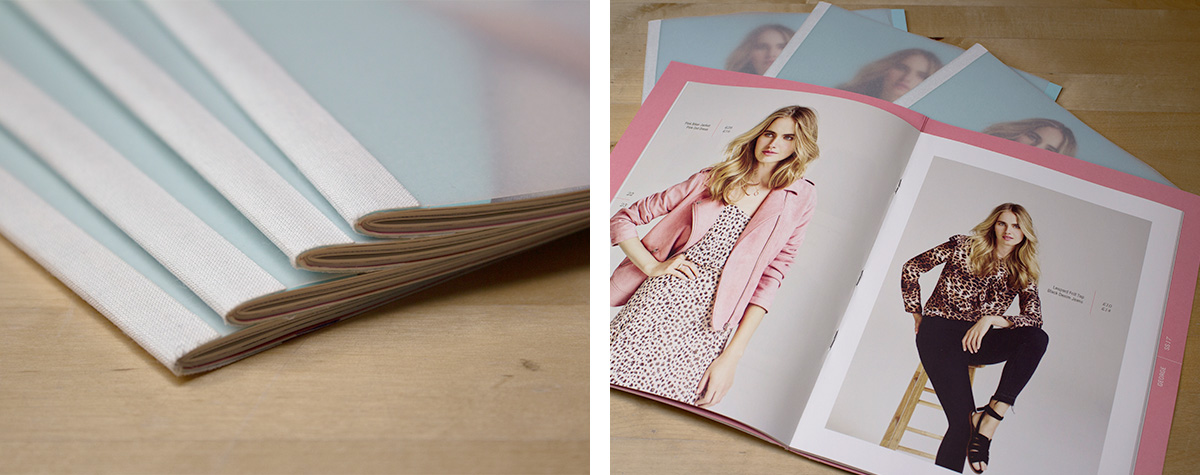
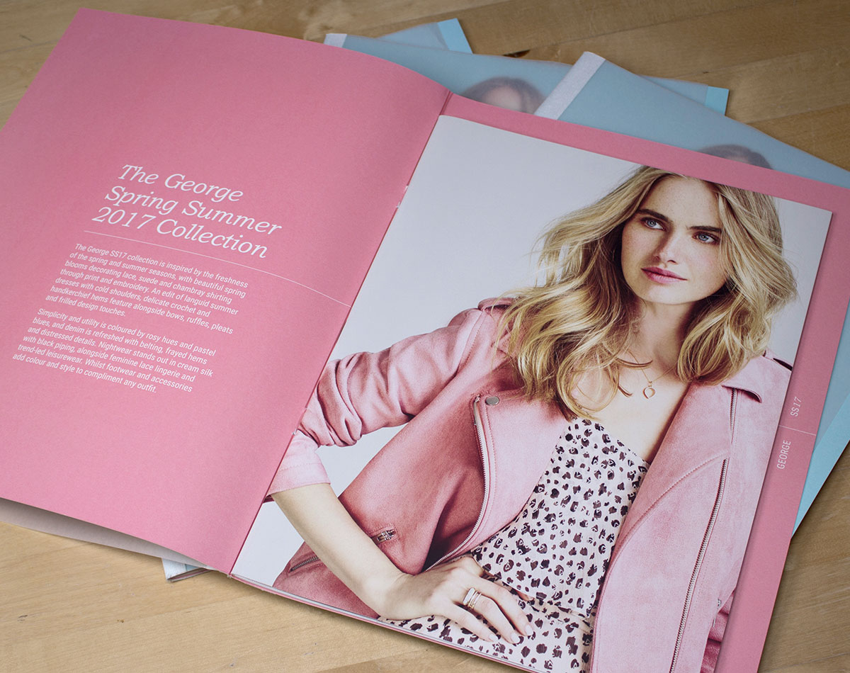
For the Spring Summer range we created a bright design using pink and blue with cut-outs of the models. We used a key line accent to complement the product names and prices which helped to create a nice crisp and clean look. We chose a contrasting modern serif font to pick out the prices and range titles and this also allowed the images to be displayed full size letting the photography speak for itself. The cover for the SS17 Lookbook was slightly bigger than the inner pages and had a tracing paper cover to add interest and impact whist also allowing the inner pages to be smaller giving an unusual look to the inner spreads .
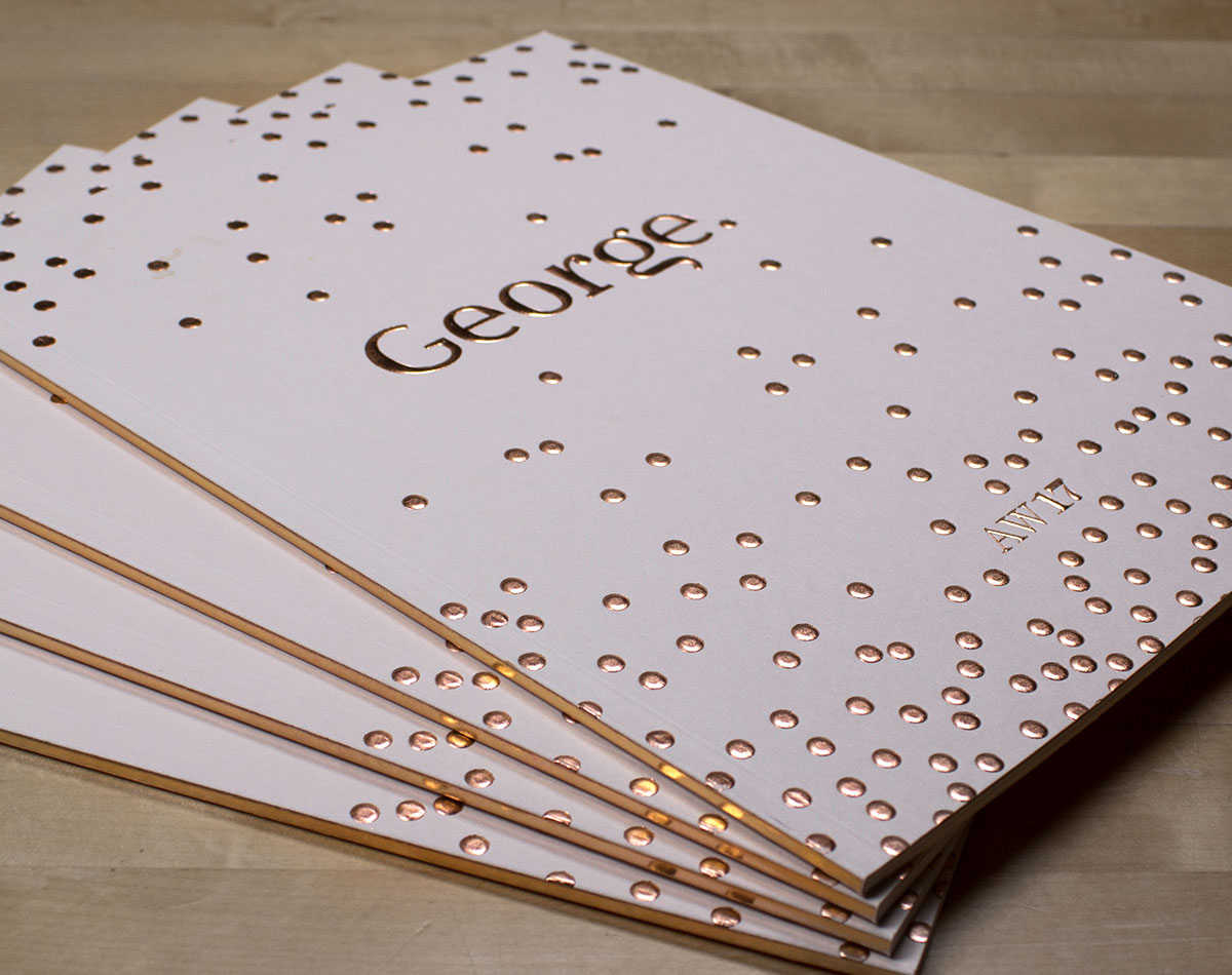
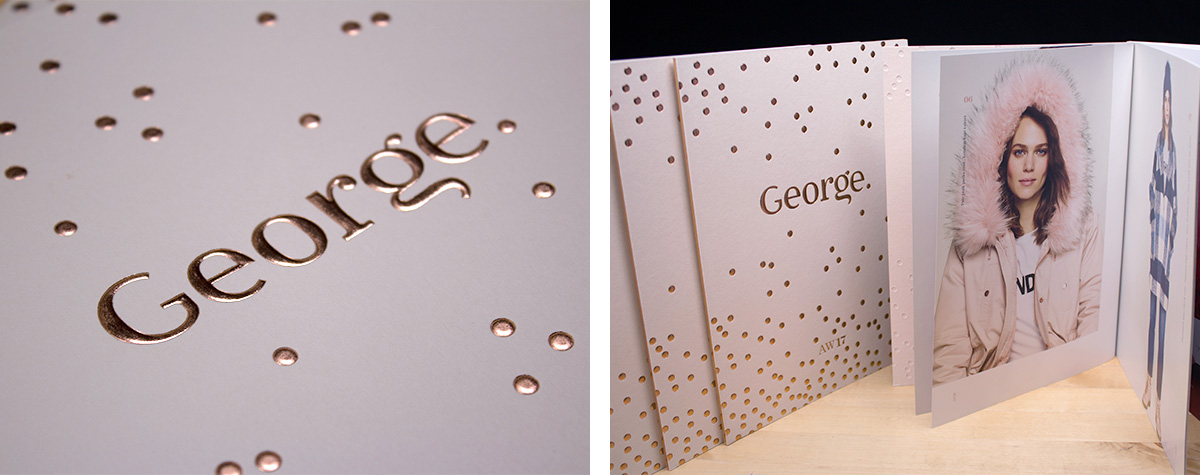
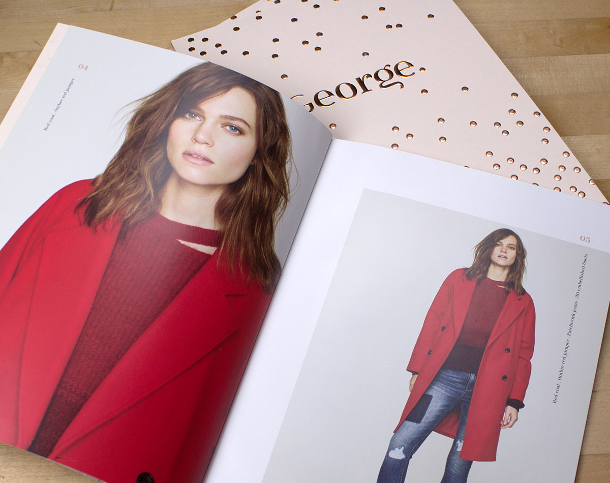
The Autumn Winter Lookbook had more pages and allowed us to design a perfect bound book with a spine. We used Rose Gold foil and uncoated GF Smith paper as design inspiration to create a more graphical cover using circles and an embossed George logo. Rose Gold ink was also used throughout the spreads to carry the theme through and we showed the product descriptions on a vertical grid to help give more free space for the images. This therefore created a modern yet different direction which is what we wanted we achieve.
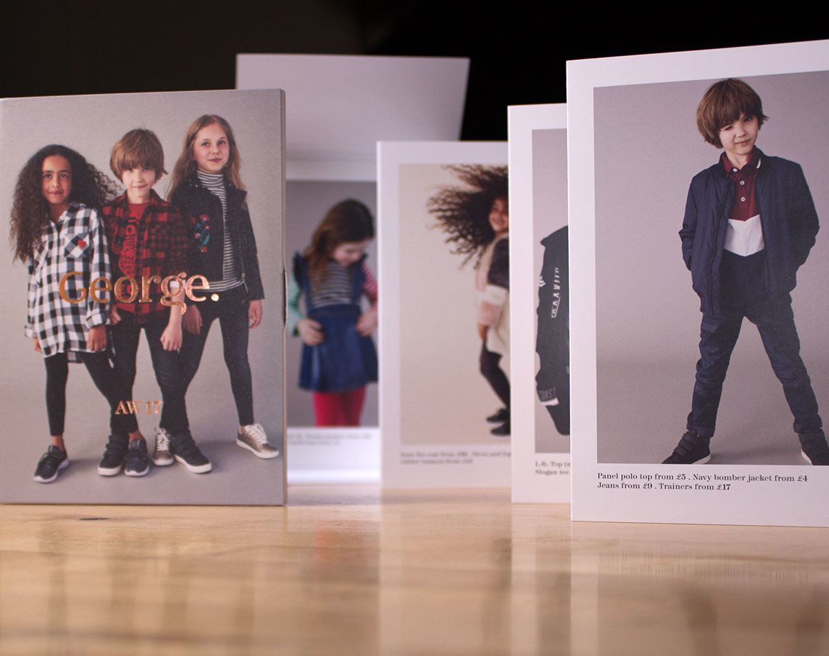
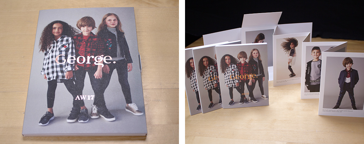
The kids versions followed suit but we designed these using a very unusual concertina folded A6 folder/book. The Rose Gold metallic George logo on the cover really stands out and the mini Lookbook design was printed on the same uncoated GF Smith stock for maximum quality and to make it sit comfortably next to the Women Lookbook.
