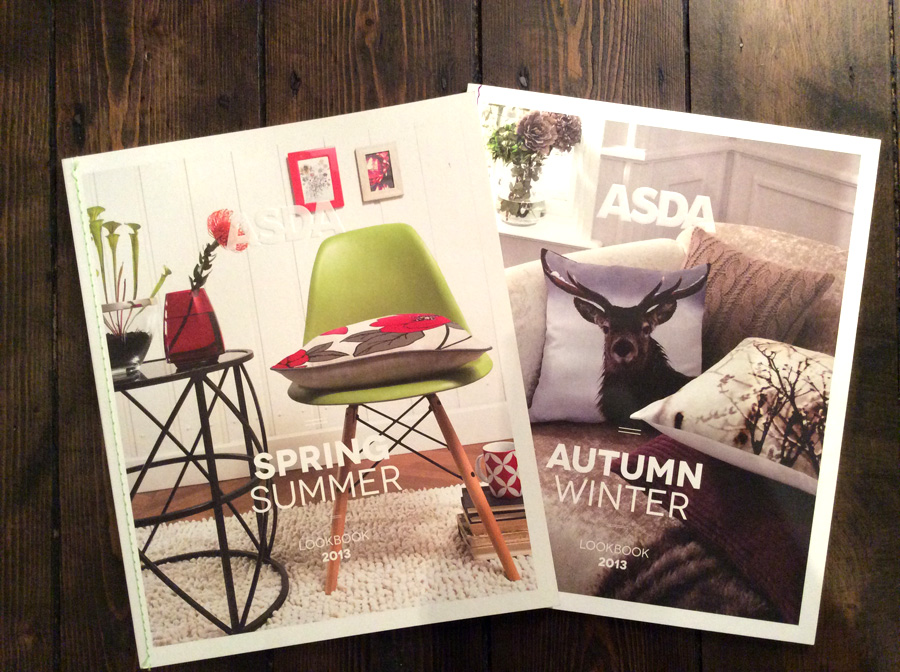
We are CODA have produced the 2nd bi-annual LookBook for ASDA’s new 2013 range and the design has been very well received. We were extremely happy with the positive comments received from the Spring/Summer launch back in October and we are confident the new Autumn/Winter edition will produce the same reaction. The launch for the Autumn/Winter LookBook will be taking place in London in the near future.
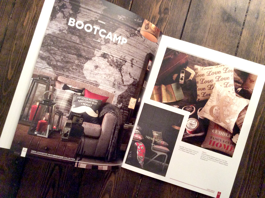
We think this is certainly one of our best designs yet and with the addition of new premium G F Smith paper stocks, the finished LookBook really does look and feel fantastic. We have developed the design considerably over the last 2 seasons in order to keep the LookBook fresh. To give this season a very different look, we have changed the size format to be a large coffee table size book. The balance of the text and imagery is greatly considered by using a sophisticated grid system. Using the new design grid, we created interesting spreads for each range which also allowed us to change the way each page looked to give individuality. We have also included some A6 tip-ins which appear at the start of each range to highlight designer ‘trend notes’ for each of the ranges.

The final LookBook has an exposed hand stitched spine and an embossed ASDA logo to help communicate the quality of the ASDA home furnishing brand and to make the design look stylish and modern. Overall we feel the final result is unexpected for an ASDA publication and this will open eyes to the quality and unexpected nature of the new ASDA ranges.
The LookBook design will be added to our project gallery soon… watch this space!


